Visualise Cytometry Data with cyto_plot()
Dillon Hammill
2021-04-19
Source:vignettes/CytoExploreR-Visualisations.Rmd
CytoExploreR-Visualisations.RmdOverview
Visualisation of high dimensional cytometry data requires powerful and robust tools to explore the data. To address this need, CytoExploreR comes with its own custom base plotting function called cyto_plot. cyto_plot is an essential component of this package and is deployed whenever data visualisations are required. This means that any function in CytoExploreR which generates a plot accepts all of the cyto_plot arguments as well. Learning the inner workings of cyto_plot is therefore essential to users getting the most out of CytoExploreR and their cytometry data.
cyto_plot we will use the Activation dataset shipped with CytoExploreRData. To prepare this dataset users will need to download the FCS files, load in the files, apply compensation, transform the fluorescent channels and apply the gatingTemplate.
# Load required packages
library(CytoExploreR)
library(CytoExploreRData)

# Load Activation GatingSet
gs <- cyto_load(
  system.file(
    "extdata/Activation-GatingSet",
    package = "CytoExploreRData"
  )
)
Key Principles
cyto_plot takes on cytometry data and plots the data in the specified channels or markers. The type of plot generated by cyto_plot is determined by the number of channels or markers supplied to the channels argument. A single channel will result in the construction of a 1D density histogram, whilst input of two channels will construct a 2D scatter plot. cyto_plot is particularly useful for plotting multiple samples, as these samples are automatically arranged in an appropriately sized grid.
# 2D scatter plot
cyto_plot(gs[[32]],
          parent = "T Cells",
          channels = c("CD4","CD8"),
          title = "2-D Scatter")

# 1D density distribution
cyto_plot(gs[[32]],
          parent = "T Cells",
          channels = "CD4",
          title = "1-D Histograms")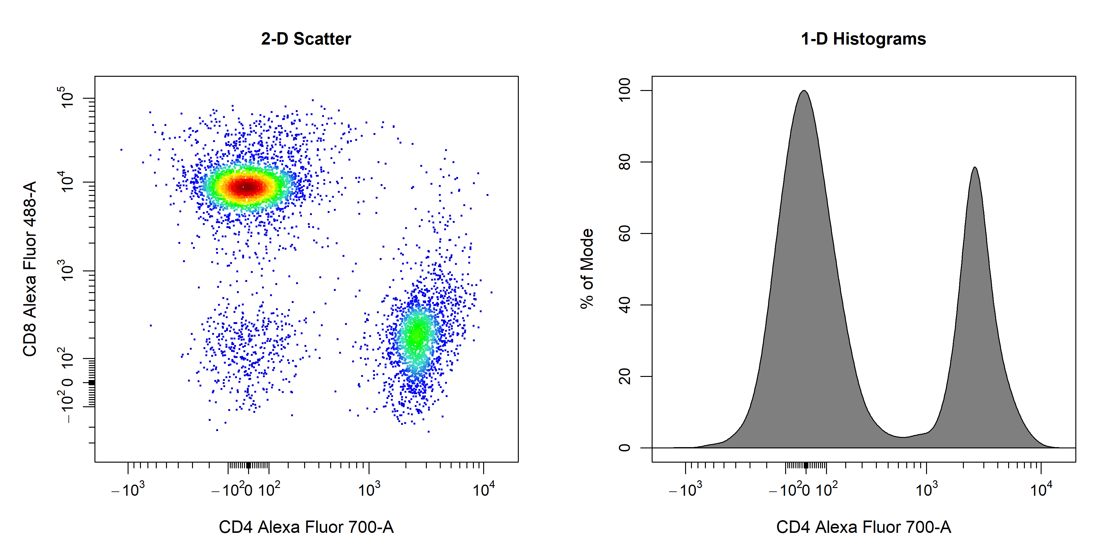
Key Features
cyto_plot in a single vignette. Nevertheless, here we will explore some of the key features that will be useful for routine analyses. We will start with features that are common to all plot types (e.g. titles, labels, axes and legends) and then move on to features that are for specific plot types (e.g. points, contour lines, densities and gates).
Titles
cyto_plot will automatically label plots with the sample name and name of the parent population which has been plotted. Titles can be removed by setting the title argument to NA.
# Custom title
cyto_plot(gs[[32]],
          parent = "T Cells",
          channels = c("CD44","CD69"),
          title = "Custom Title",
          title_text_font = 2,
          title_text_size = 2,
          title_text_col = "blue")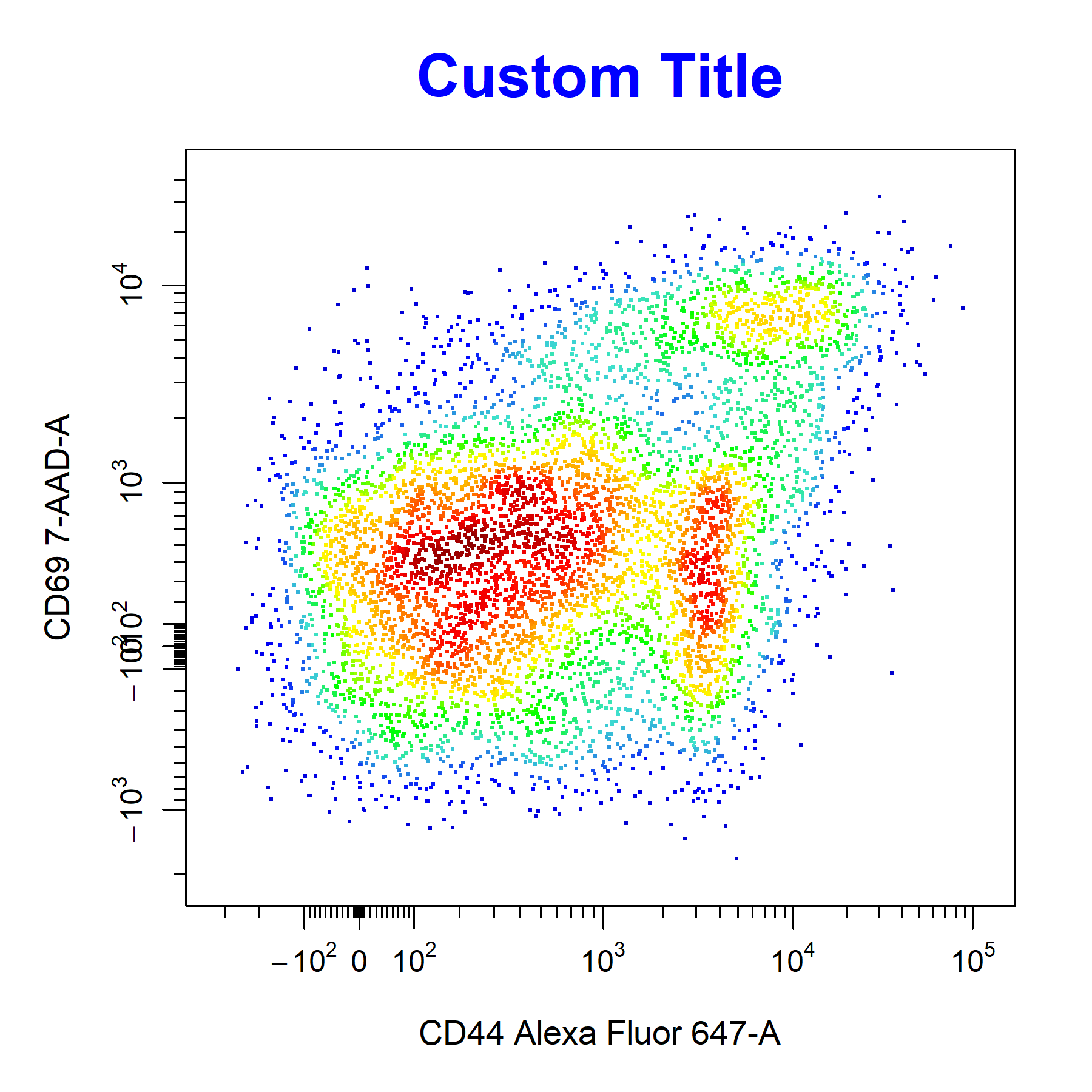
Axes Labels
cyto_plot will automatically label axes with the marker and channel names. Axes labels can be manually supplied through the xlab and ylab arguments. Axes text can be customised but the same customisation is applied to both the x and y axes.
# Customise axes labels
cyto_plot(gs[[32]],
          parent = "T Cells",
          channels = c("CD4", "CD8"),
          xlab = "CD4",
          ylab = "CD8",
          axes_label_text_font = 2,
          axes_label_text_size = 2,
          axes_label_text_col = "red",
          title = "Custom Axes Labels")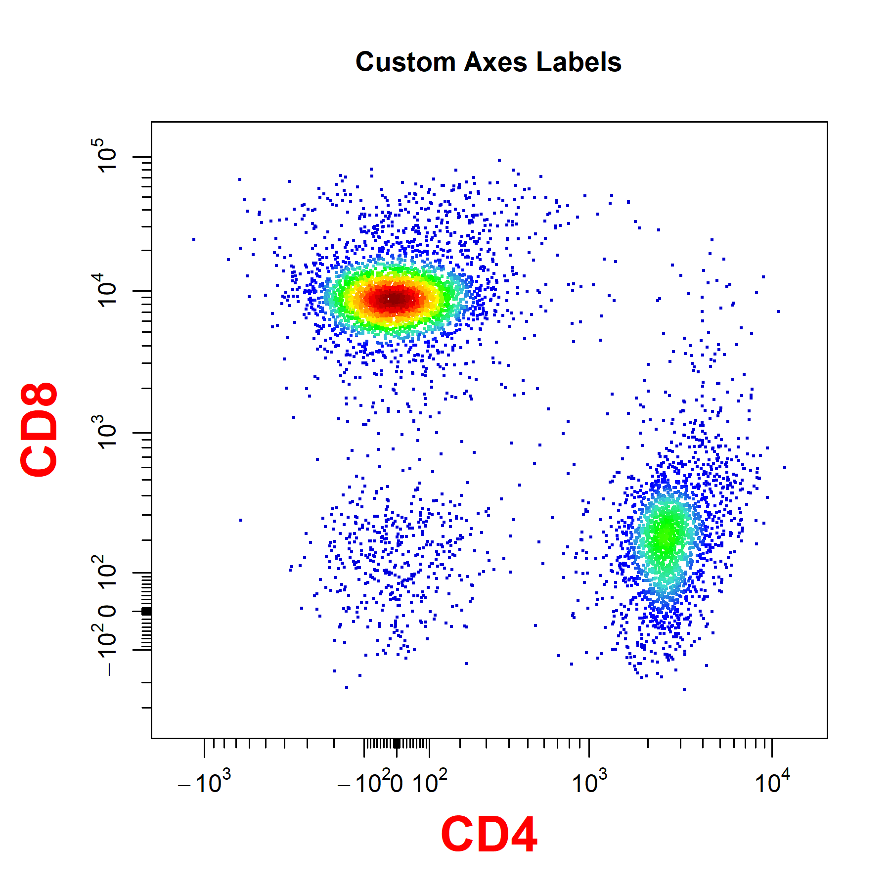
Axes Transformations
cyto_plot does not perform in-line transformations, this means that the data must be appropriately transformed prior to plotting. The list of applied transformers will be extracted directly from the GatingSet or GatingHierarchy to ensure that the axes are appropriately displayed. Since flowFrame and flowSet objects do not retain these transformation definitions, users will need to manually supply the list of transformers to the axes_trans argument when plotting these objects.
# Pull transformers from GatingSet
trans <- cyto_transformer_extract(gs)

# Pull out T Cells flowSet
T_Cells <- cyto_extract(gs, "T Cells")

# Layout
cyto_plot_custom(c(1,2))

# Axes on current scale
cyto_plot(T_Cells[[32]],
          channels = c("CD4","CD8"),
          title = "Transformers Missing",
          layout = FALSE)

# Axes appropriately transformed
cyto_plot(T_Cells[[32]],
          channels = c("CD4","CD8"),
          axes_trans = trans,
          title = "Transformers Supplied",
          layout = FALSE)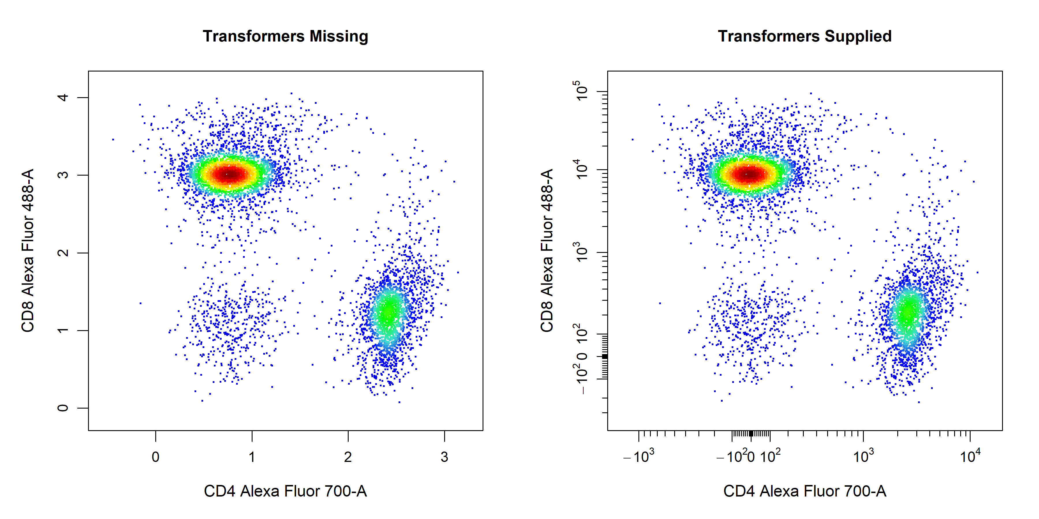
Axes Text
axes_text arguments controls whether to include axes text for the x or y axes on the plot. The default is set to c(TRUE, TRUE) to display axes text on the x and y axes respectively. Setting either of these values to FALSE will remove the axes text from the respective axis.
# Customise axes_text
cyto_plot(gs[[32]],
          parent = "T Cells",
          channels = c("CD4","CD8"),
          axes_text = c(TRUE, FALSE), # remove y axis text
          axes_text_font = 1,
          axes_text_size = 1.4,
          axes_text_col = "purple",
          title = "Custom Axes Text")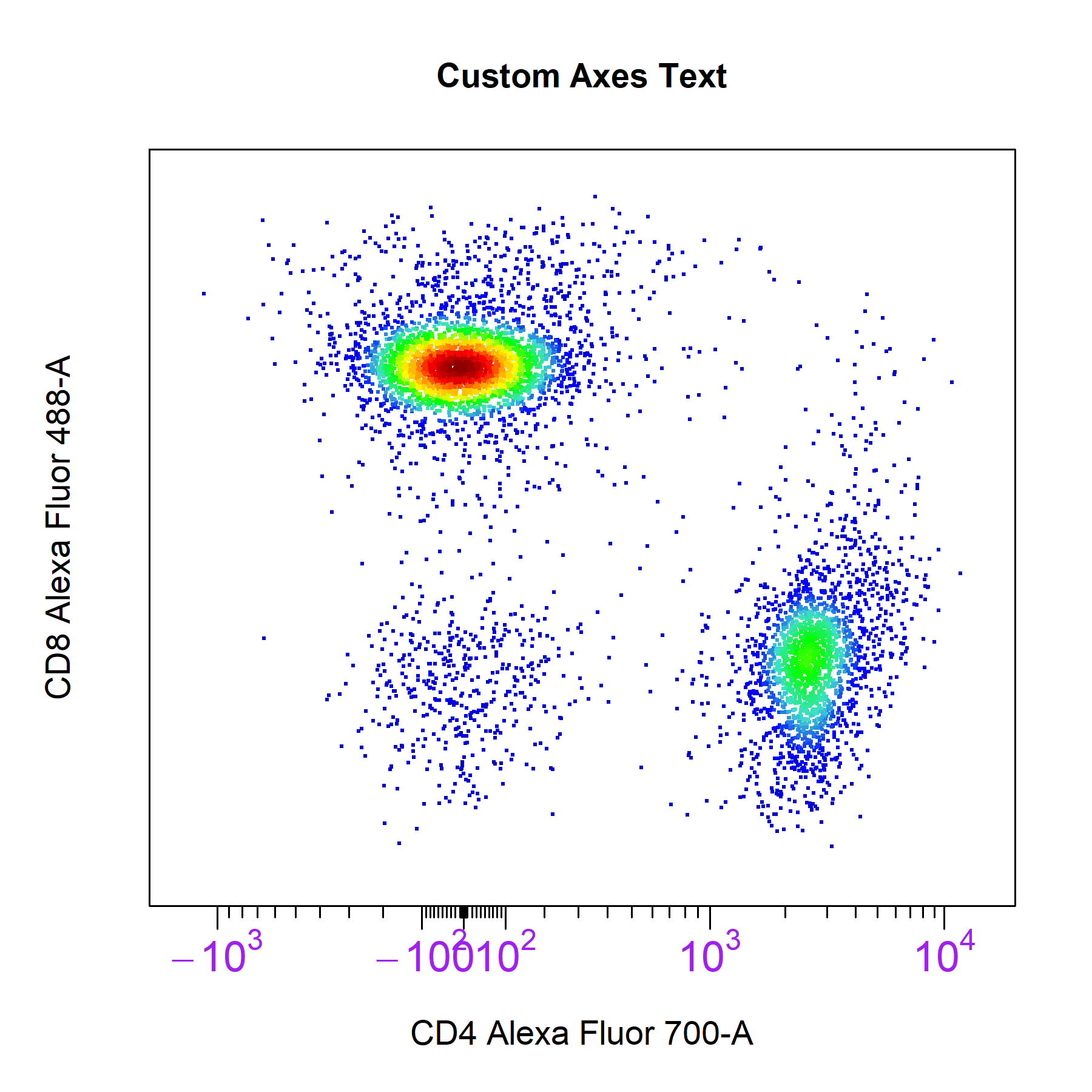
Axes Limits
cyto_plot will automatically calculate axes limits that encompass all the plotted and gated data. cyto_plot comes with three preset axes_limits options which provide a quick way to optimise the axes limits of plots without manual adjustment.
# Machine axes limits
cyto_plot(gs[[32]],
          parent = "T Cells",
          channels = c("Va2", "CD4"),
          axes_limits = "machine",
          title = "Machine Limits")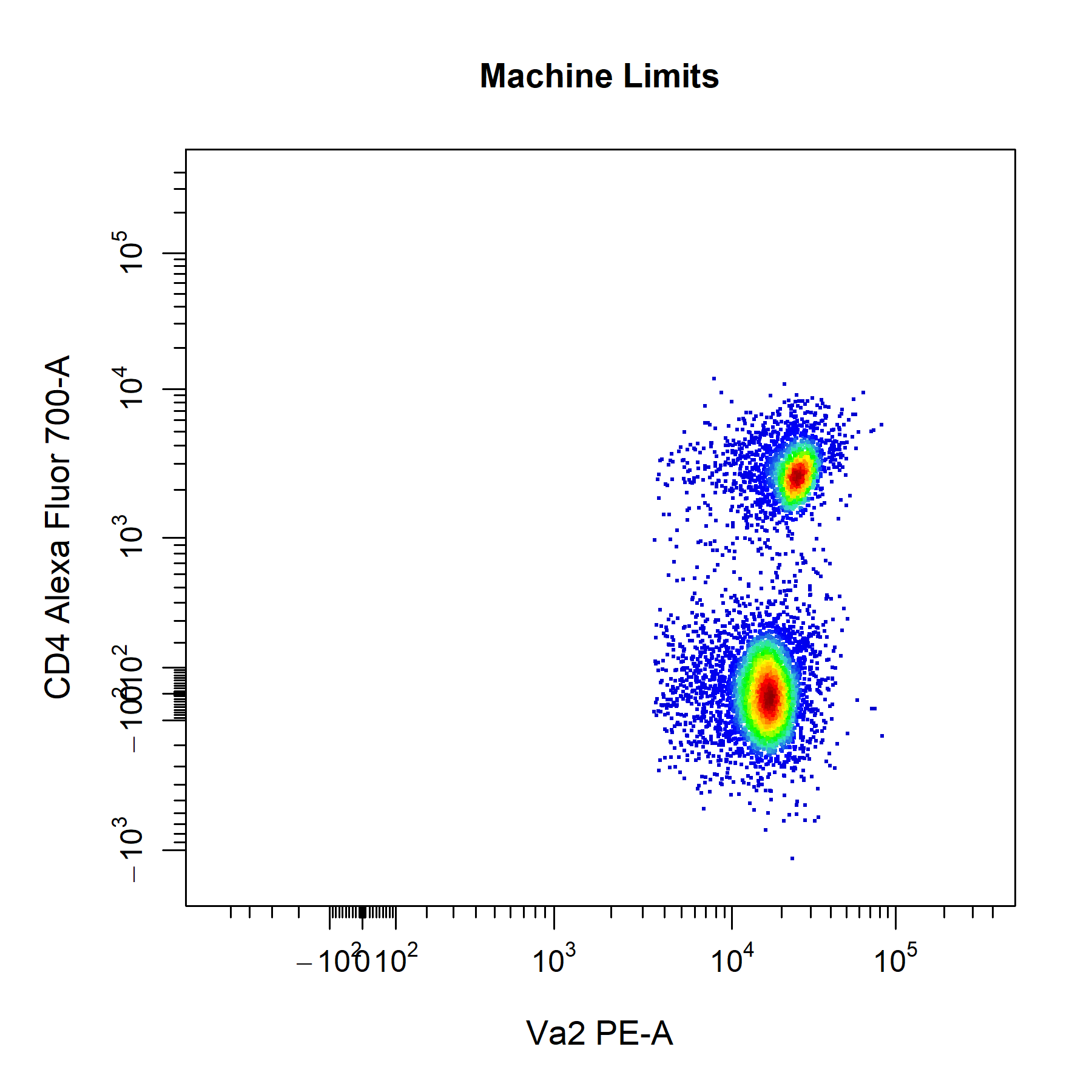
# Data axes limits
cyto_plot(gs[[32]],
          parent = "T Cells",
          channels = c("Va2", "CD4"),
          axes_limits = "data",
          title = "Data Limits")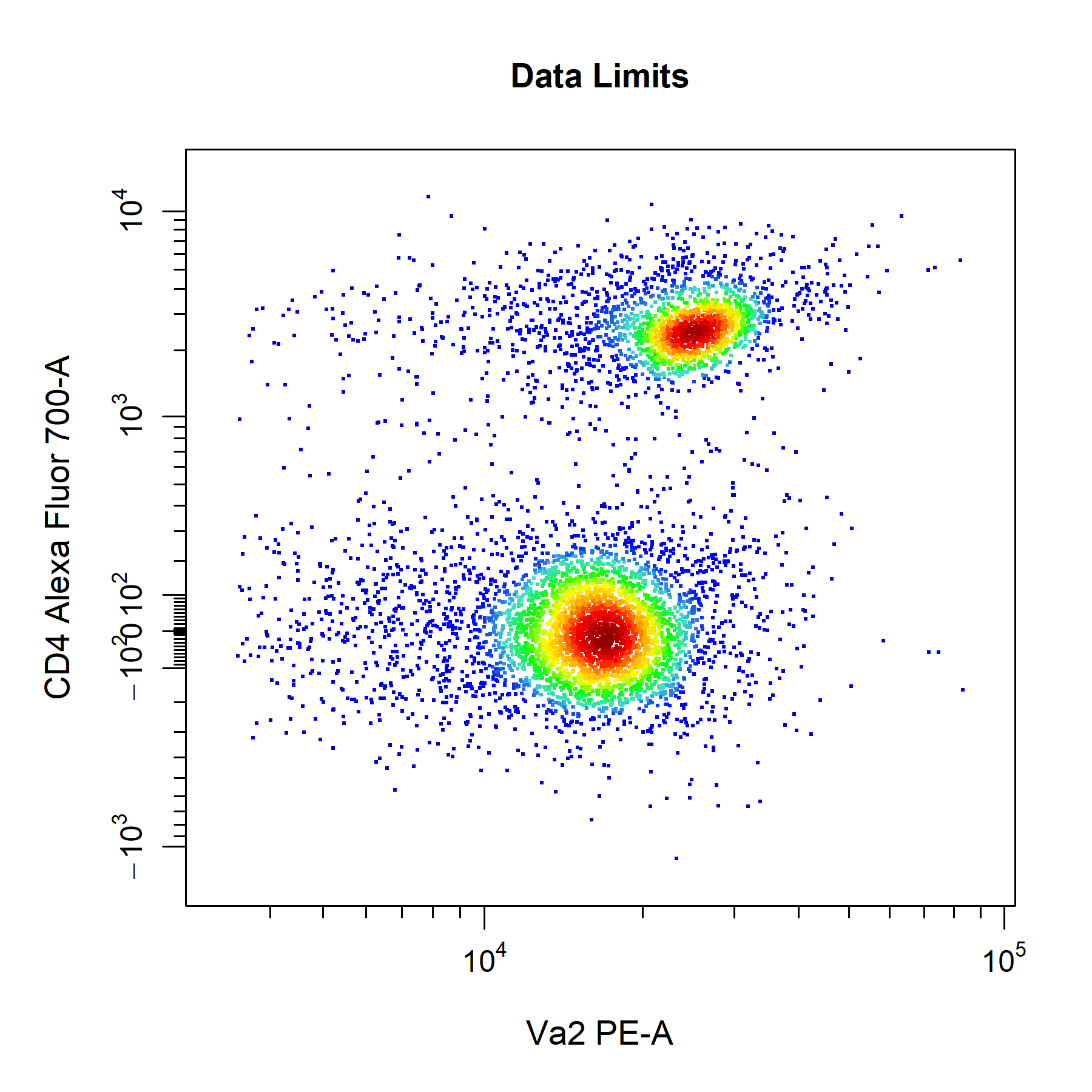
axes_limits setting in cyto_plot.
# Auto axes limits
cyto_plot(gs[[32]],
          parent = "T Cells",
          channels = c("Va2", "CD4"),
          axes_limits = "auto",
          title = "Auto Limits")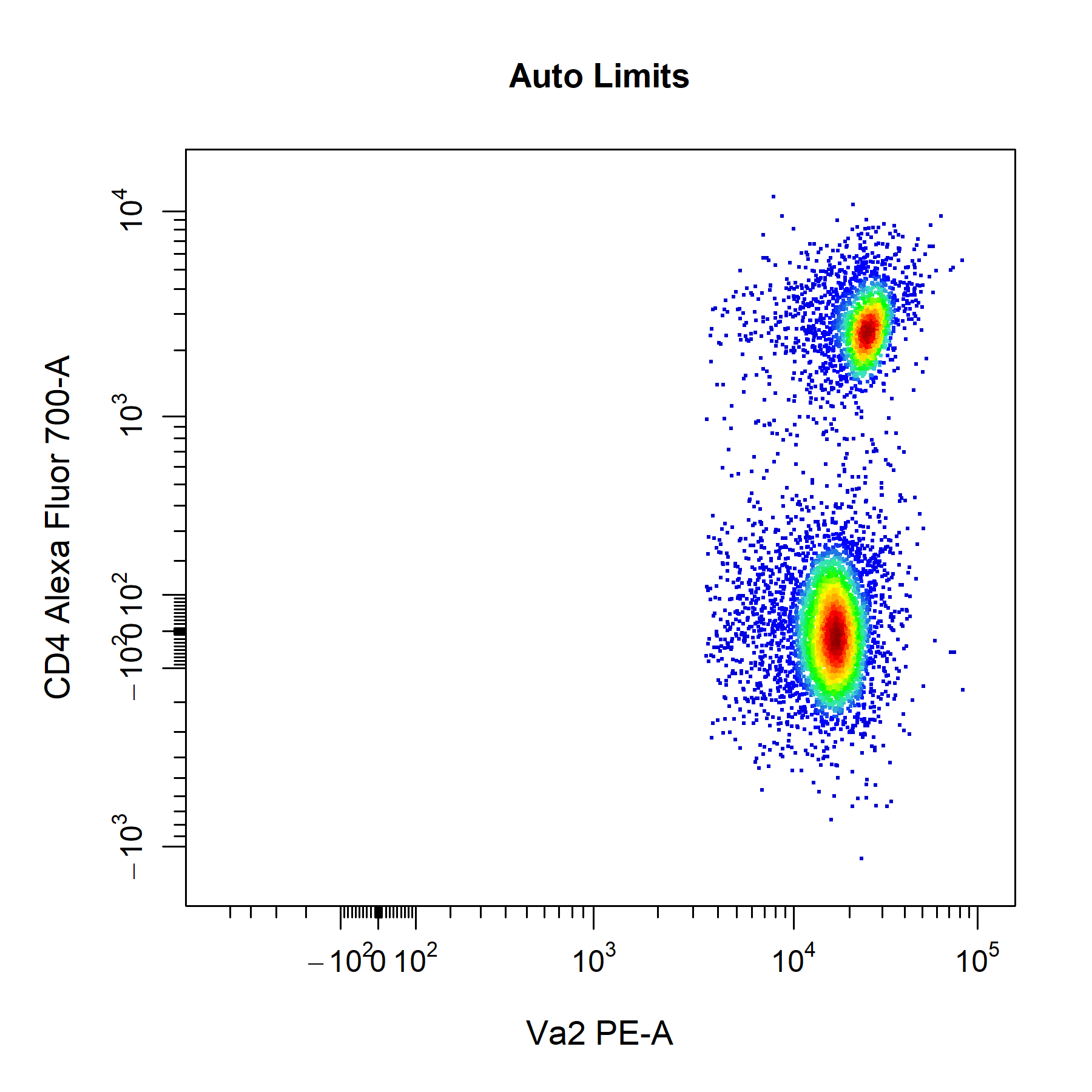
cyto_plot will automatically add a 3% buffer onto either end of the axes for the above settings. The degree of buffering can be altered by supplying a decimal percentage to the axes_limits_buffer argument. Of course, you can also manually adjust the axes limits by supplying specific values to the xlim and ylim arguments to modify the x and y axes limits respectively. Values supplied through these arguments will always override those specified by the axes_limits argument.
# Custom axes limits
cyto_plot(gs[[32]],
          parent = "T Cells",
          channels = c("Va2", "CD4"),
          xlim = c(-10, 65000),
          ylim = c(-500, 10000),
          title = "Custom Axes Limits")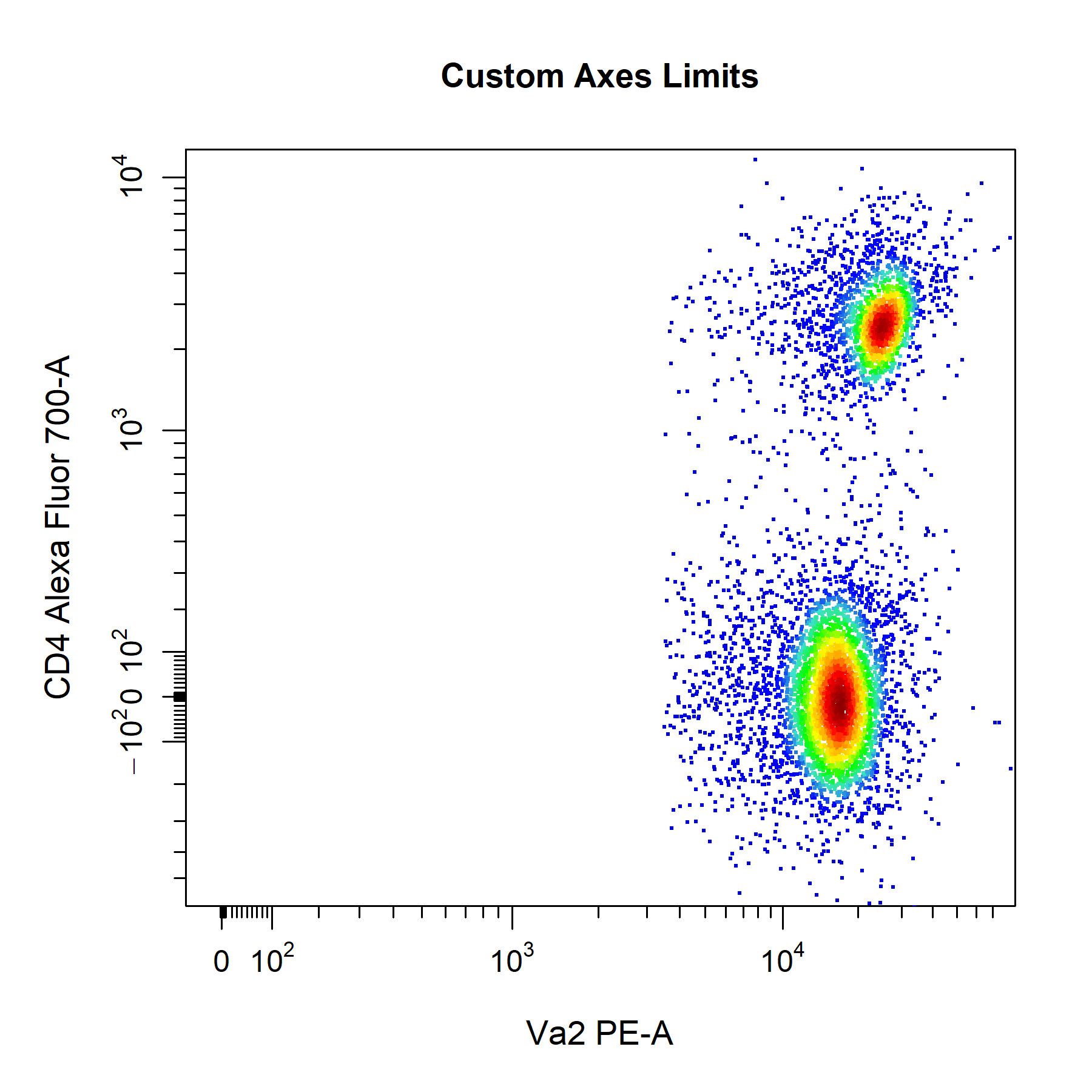
Display
cyto_plot has a display argument which can be used to display a proportion of the total events. To indicate the amount of events to display, users can set display to 1 to display all events, less than 1 to specify a percentage of events to display or a numeric greater than 1 to specify the number of events to display. To improve performance, the display argument is set to 25000 events by default in cyto_plot. cyto_plot will automatically adjust the level of sampling for overlays to ensure that event ratios are maintained. For example, if we have a total of 5000 T Cells of which we display 2000 events in the plot. If we overlay the CD4 T Cells (2500 total events), 1000 events (instead of the indicated 2000 events) will be displayed to maintain the original ratio to the T Cells population. The only case where the same sampling is applied to overlays is when the overlaid data comes a different sample to the base layer. For example, plotting an unactivated sample and overlaying an activated one, will result in the same sampling being applied to both layers (e.g. 2000 events).
# Display all events
cyto_plot(gs[[32]],
          parent = "root",
          channels = c("FSC-A", "SSC-A"),
          display = 1,
          title = "All Events")

# Display 5000 events
cyto_plot(gs[[32]],
          parent = "root",
          channels = c("FSC-A", "SSC-A"),
          display = 5000,
          title = "5000 Events")

# Display 20% of events
cyto_plot(gs[[32]],
          parent = "root",
          channels = c("FSC-A", "SSC-A"),
          display = 0.2,
          title = "20% of Events")

# Display default 25000 events
cyto_plot(gs[[32]],
          parent = "root",
          channels = c("FSC-A", "SSC-A"),
          title = "Default 25000 Events")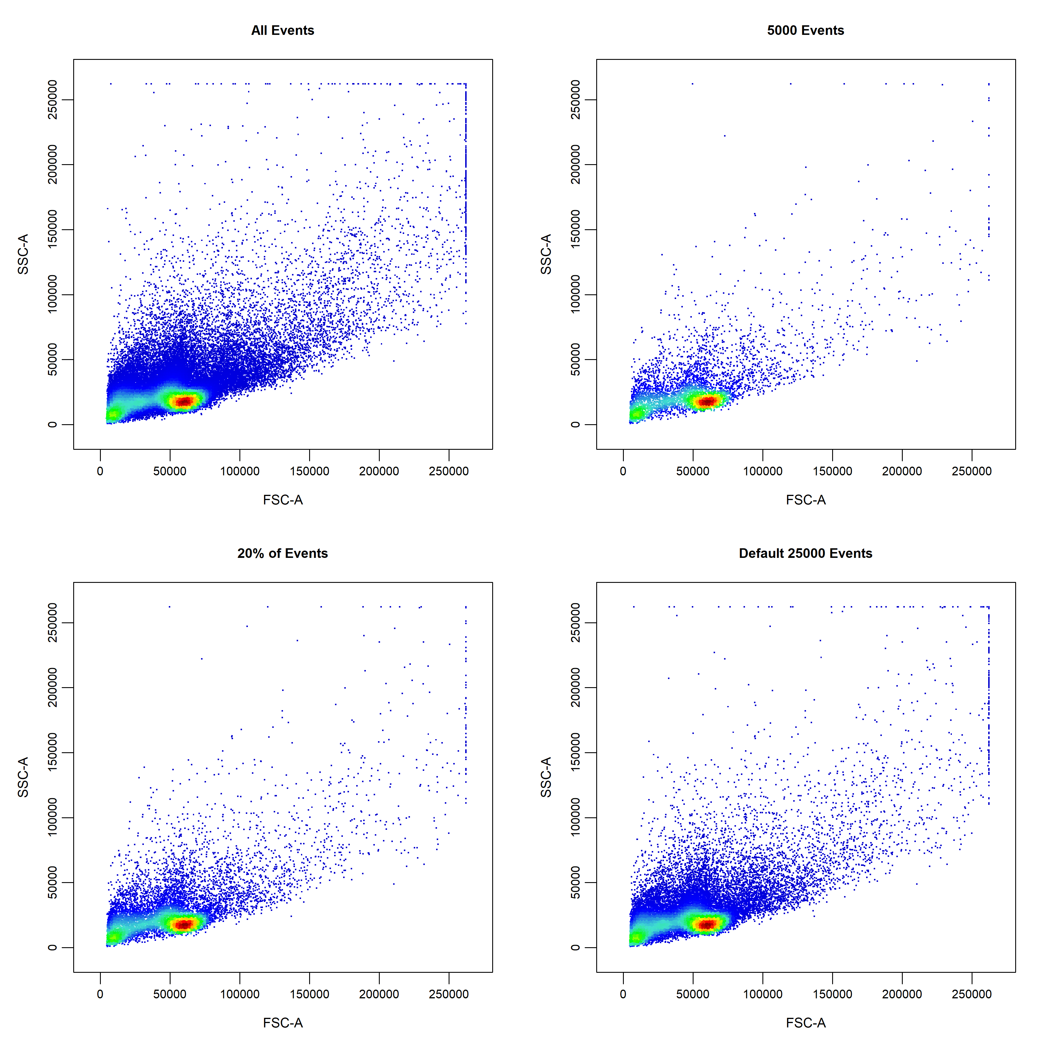
Legends
cyto_plot by setting the legend argument to TRUE. cyto_plot will automatically populate the legend with the name of the samples or populations where appropriate. The text in the legend can be altered by supplying a vector of character strings to the legend_text argument in bottom-up order.
# Custom legend
cyto_plot(gs[[32]],
          parent = "T Cells",
          channels = c("CD4", "CD8"),
          overlay = "descendants",
          legend = TRUE,
          legend_text = c("T Cells",
                          "CD8 T Cells",
                          "CD69+ CD8 T Cells", # not required
                          "CD4 T Cells",
                          "CD69+ CD4 T Cells"),
          legend_text_font = 1,
          legend_text_size = 1,
          legend_text_col = "black",
          title = "Custom Legend")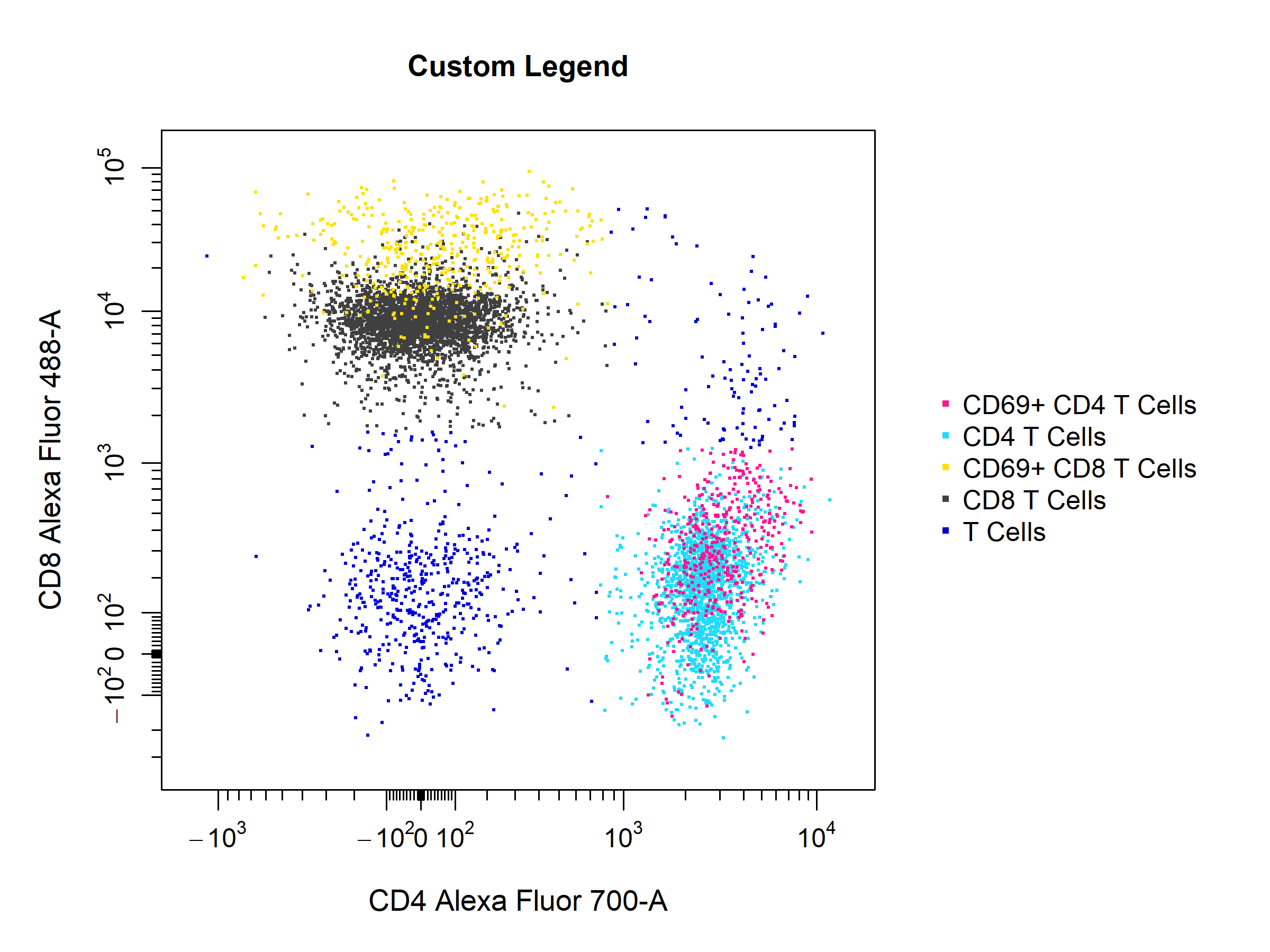
Borders
cyto_plot through supplying colours to the border_line_col and border_fill arguments respectively.
# Custom border
cyto_plot(gs[[32]],
          parent = "T Cells",
          channels = c("CD4","CD8"),
          overlay = "descendants",
          border_fill = "black",
          border_fill_alpha = 1,
          border_line_type = 1,
          border_line_col = "red",
          border_line_width = 3,
          title = "Custom Borders")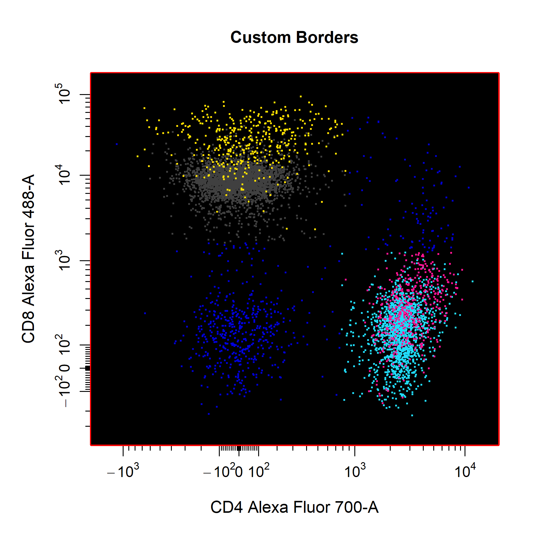
Pop-up Windows
popup argument to TRUE. The popup argument is set to FALSE by default to plot in the RStudio graphics device.
# Plot in popup window
cyto_plot(gs[[32]],
          parent = "T Cells",
          channels = c("CD4","CD8"),
          popup = TRUE)
Layouts
cyto_plot will automatically arrange samples in an appropriately sized square grid when multiple samples are supplied for plotting. The number of plots to include on each page can be manually controlled through the layout argument, which expects a vector indicating the number of rows and columns to use.
# Custom layout
cyto_plot(gs[30:32],
          parent = "CD4 T Cells",
          channels = c("CD44", "CD69"),
          point_size = 3,
          contour_lines = 15,
          layout = c(1,3))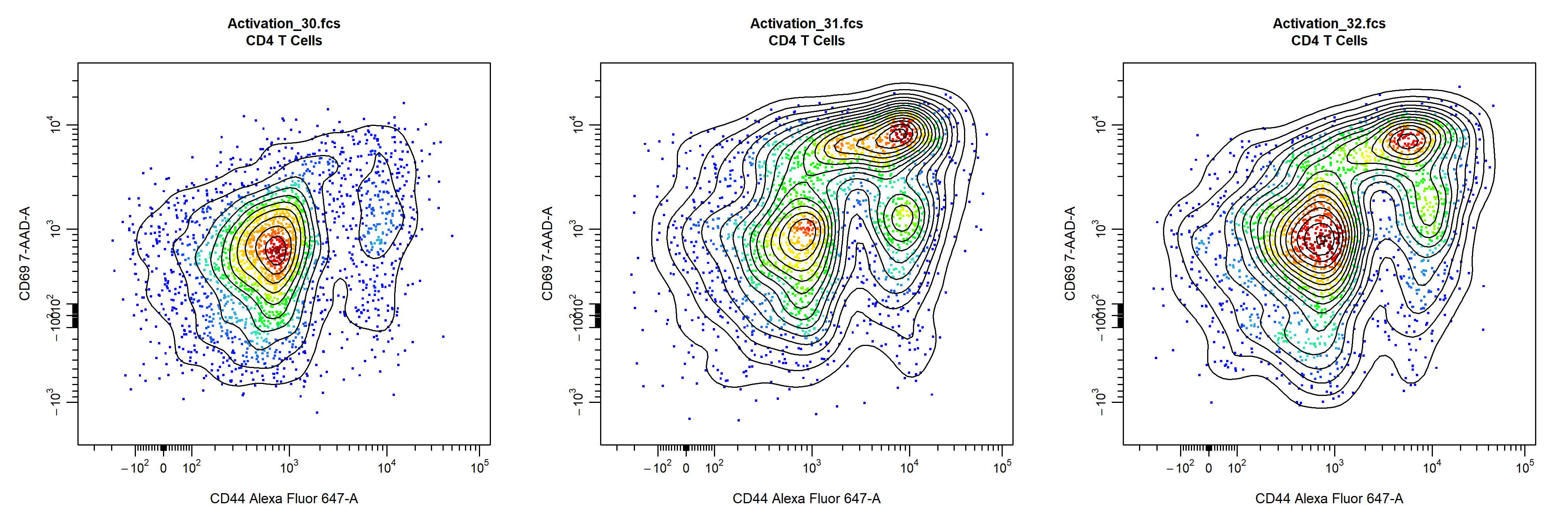
Points
cyto_plot allows customisation of points per data layer, the base layer will automatically use a colour gradient whilst colours for upper layers will be selected from a colour palette created from the colours supplied to point_cols. Point colours can also be manually supplied for each layer through the point_col argument.
# Point colour palette
cyto_plot(gs[[32]],
          parent = "T Cells",
          channels = c("CD4","CD8"),
          overlay = "descendants",
          point_col = "black", # base layer - override density gradient
          point_cols = c("red",
                         "orange",
                         "yellow",
                         "green", # upper layers
                         "blue",
                         "purple"),
          title = "Point Colour Palette")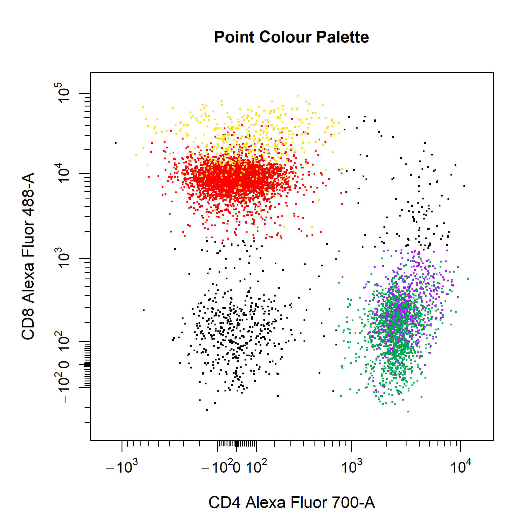
point_col_scale argument.
# Point colour scale
cyto_plot(gs[[32]],
          parent = "T Cells",
          channels = c("CD4","CD8"),
          point_col_scale = c("black",
                              "brown",
                              "red",
                              "orange",
                              "yellow",
                              "white"),
          title = "Point Colour Scale")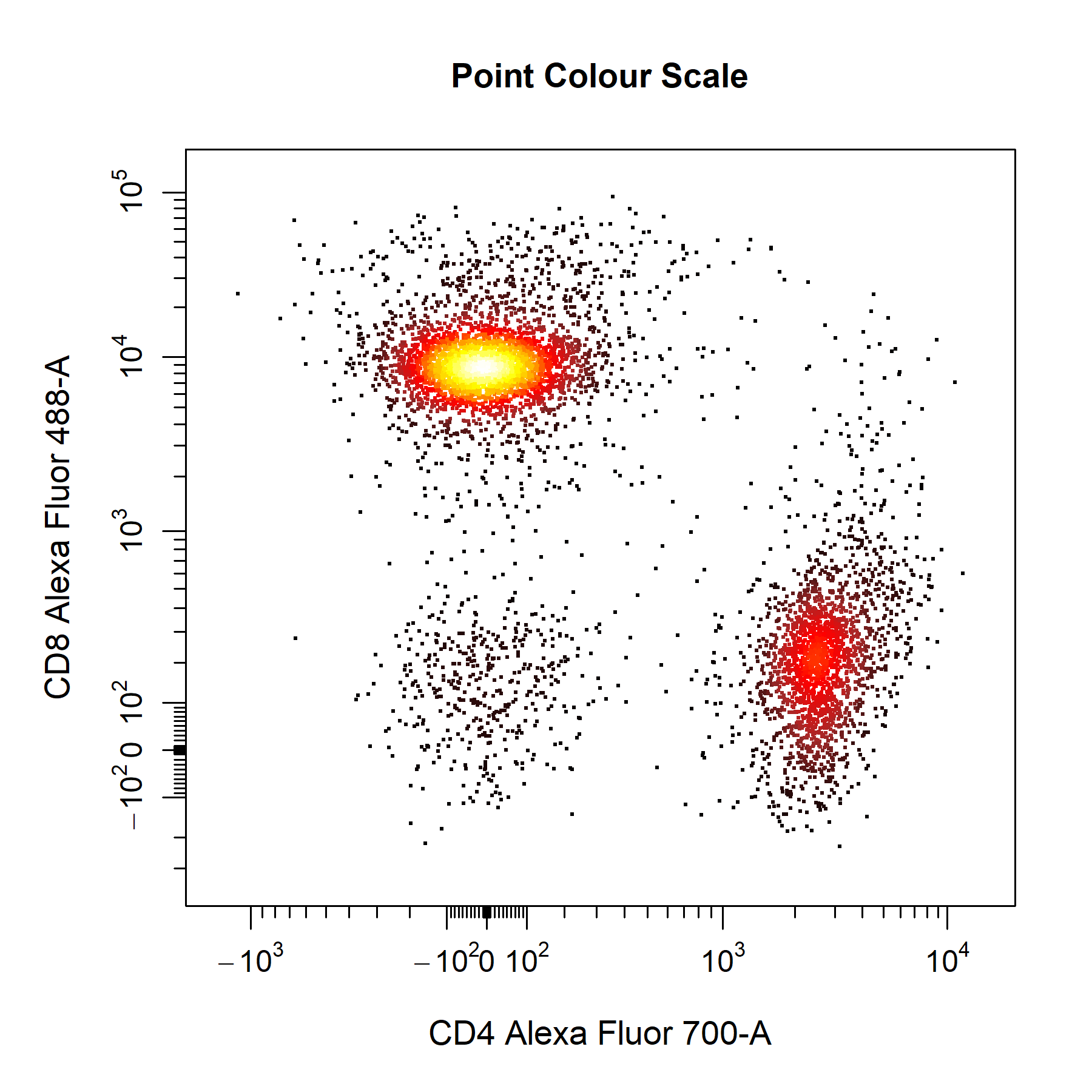
point_col_alpha argument is particularly useful in retaining some density features when a single colour is supplied.
# Customise points
cyto_plot(gs[[32]],
          parent = "T Cells",
          channels = c("CD4", "CD8"),
          point_shape = ".",
          point_size = 3,
          point_col = "red",
          point_col_alpha = 0.4)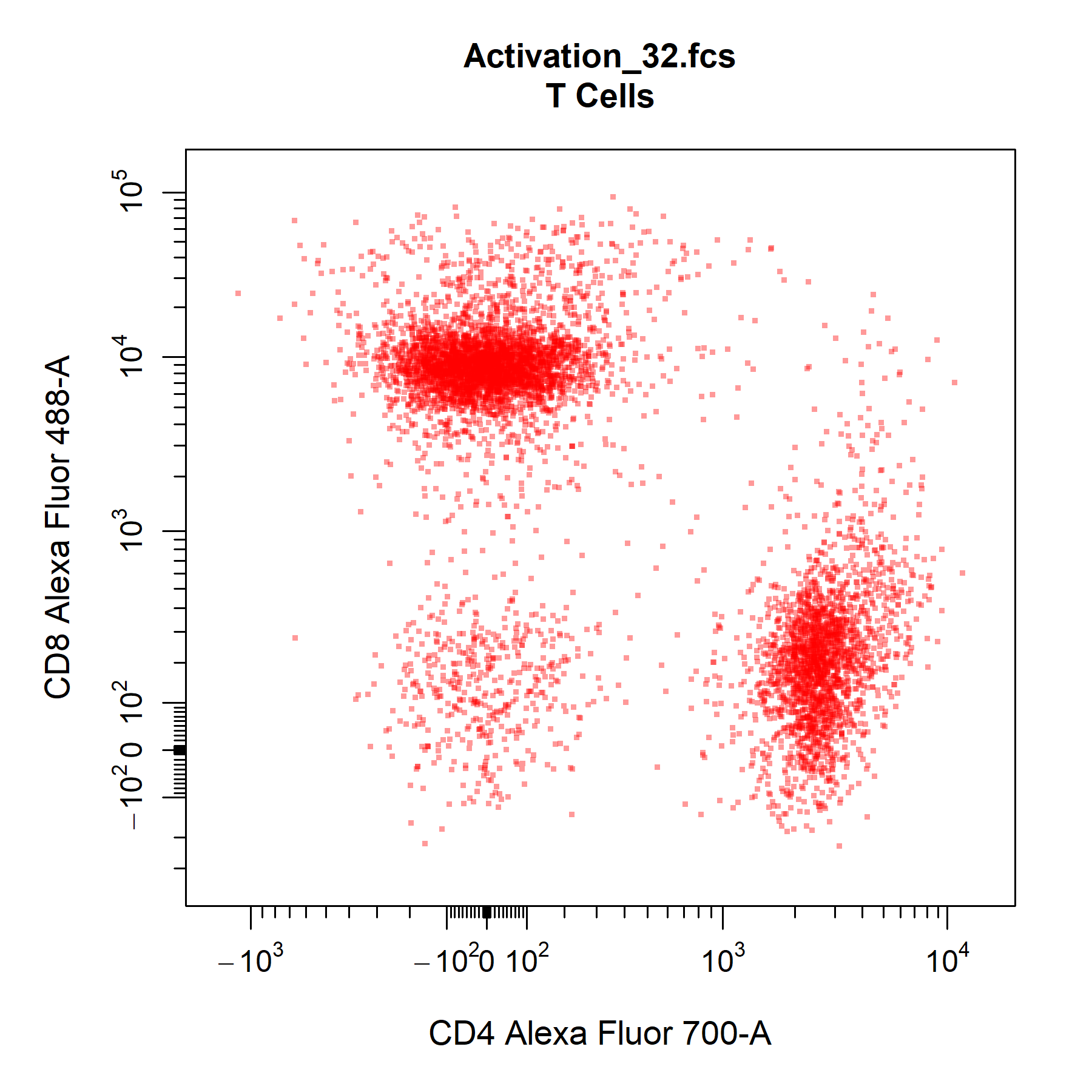
Contour Lines
cyto_plot layers contour lines on top of the underlying data points such that all data is clearly visible. To add contour lines to plot, simply specify the number of contour levels to the contour_lines argument. Contour lines are fully cusomisable and supported for each data layer in the plot. To add contour lines to overlaid data simply a vector of levels for each layer to the contour_lines argument.
# Contour lines
cyto_plot(gs[[32]],
          parent = "T Cells",
          channels = c("CD4", "CD8"),
          contour_lines = 25,
          contour_line_type = 1,
          contour_line_width = 1.2,
          contour_line_col = "black",
          contour_line_alpha = 0.8,
          title = "Contour Lines")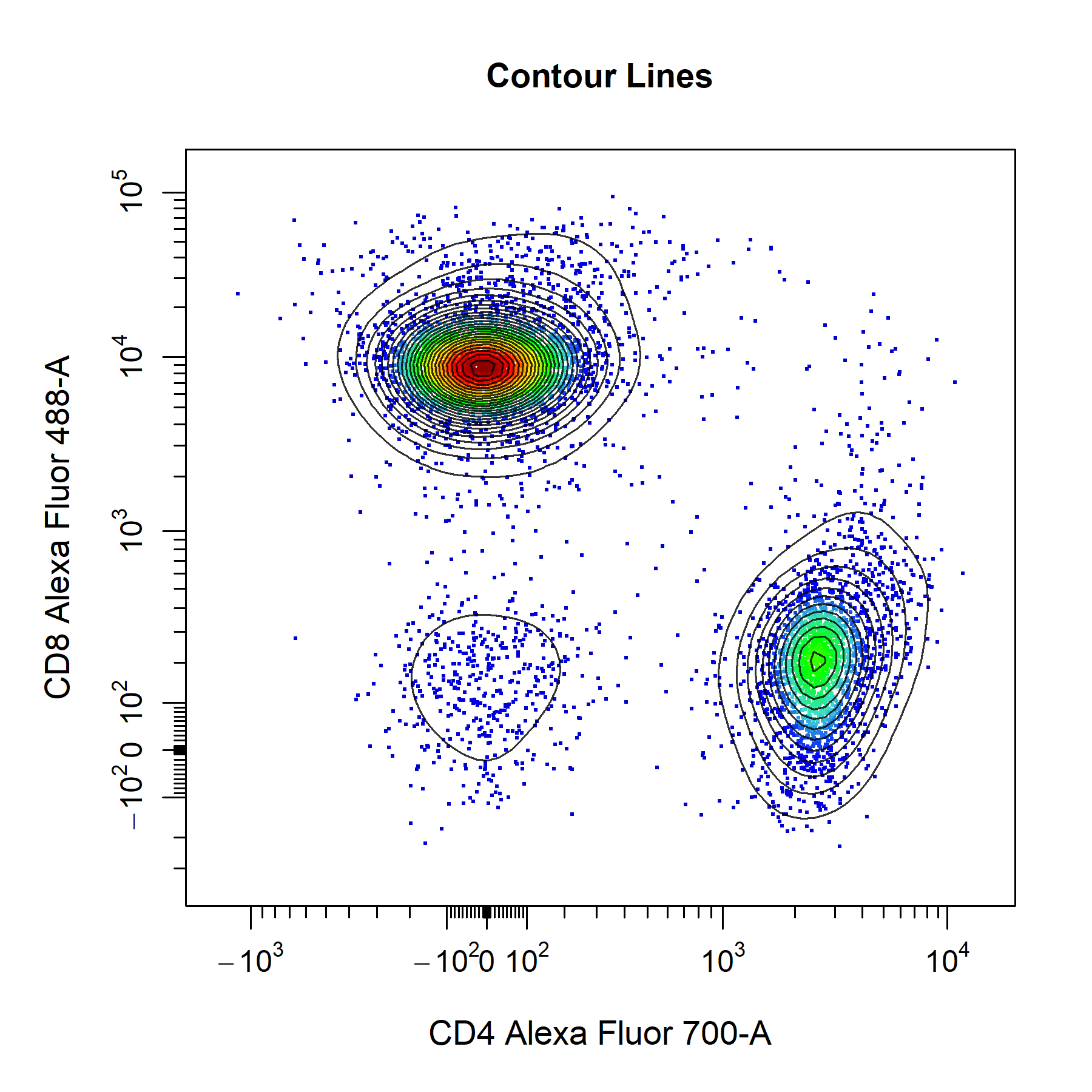
Density Distributions
cyto_plot contains a number of customisation options for 1D density distributions. Unlike 2D scatterplots, all samples are plotted onto the same plot. The smoothness of the density distribution can be altered by modifying the density_smooth argument, which is set to 0.6 by default. The degree of stacking can be controlled through density_stack and the number of layers to include per plot can be specified through density_layers. Note that each plot must contain the same number of layers (i.e. total layers must be divisible by the number of layers per plot). The density distributions are normalised to the mode by default to aid in appropriate visualisation when stacking samples. To plot the raw densities, users can set density_modal argument to FALSE. Each plot will have it own calculated binwidth which will be used for all data layers. Both the line borders and fill colours of the density distributions are fully customisable through the set of density_fill and density_line arguments. As with 2D scatterplots, legends can be included by setting the legend argument to TRUE. The default legend will use the fill colour, but users can change this to use the line colours by setting the legend argument to "line".
# Density distributions
cyto_plot(gs[25:32],
          parent = "T Cells",
          channels = "CD8",
          density_smooth = 0.4,
          density_layers = 4, # 4 samples per plot
          density_stack = 0.5, # 50% stacking
          density_modal = TRUE,
          density_fill = rep(c("red",
                           "blue",
                           "green",
                           "magenta"), 2),
          density_fill_alpha = c(rep(0, 4),
                                 0.2,
                                 0.4,
                                 0.8,
                                 1),
          density_line_type = c(1,2,3,4,rep(1, 4)),
          density_line_width = c(rep(2, 4),
                                 rep(1, 4)),
          density_line_col = c("red",
                               "blue",
                               "green",
                               "magenta",
                               rep("black", 4)))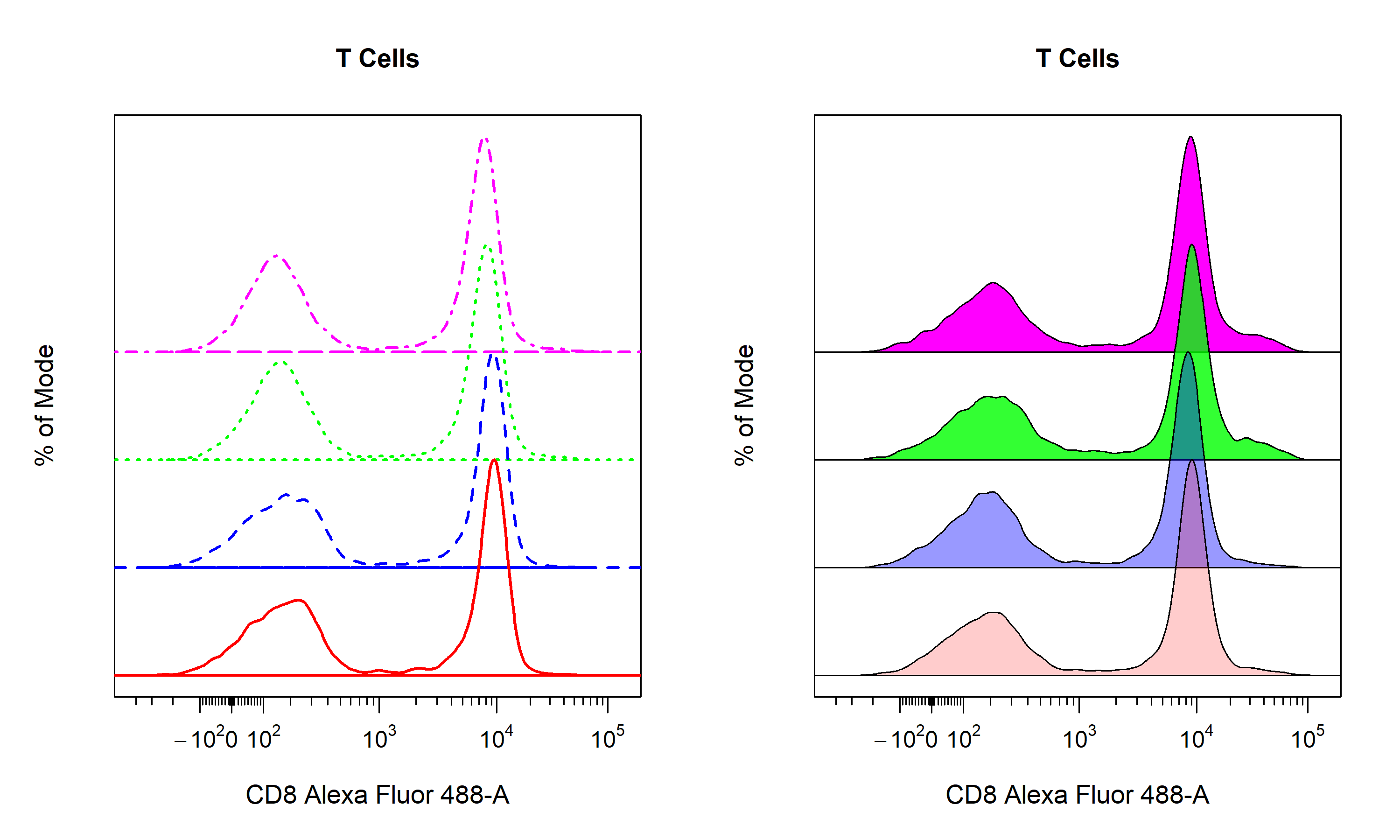
Gates
cyto_plot is capable of plotting all major flowCore gate classes including rectangleGates, polygonGates and ellipsoidGates. Gates applied to GatingSet objects can be plotted by passing the name of the gated population to the alias argument. Users can also set alias to an empty character string (i.e. "") to automatically plot any gates constructed in the specified channels. Alternatively, constructed flowCore gate objects can be passed through the gate argument for plotting. CytoExploreR now has the ability to plot statistics for negated populations (i.e. events outside gates) when the negate argument is set to TRUE. The default statistic for gated population is frequency, and the label is positioned in the center of the gate by default. Gate borders and fill are completely customisable through the set of gate_line and gate_fill arguments.
# Plot gates
cyto_plot(gs[[32]],
          parent = "T Cells",
          alias = "", # same as c("CD4 T Cells", "CD8 T Cells")
          channels = c("CD4", "CD8"),
          negate = TRUE, # statistic for events outside gates
          gate_line_type = 1,
          gate_line_width = 2,
          gate_line_col = "red",
          gate_fill = "white",
          gate_fill_alpha = 0)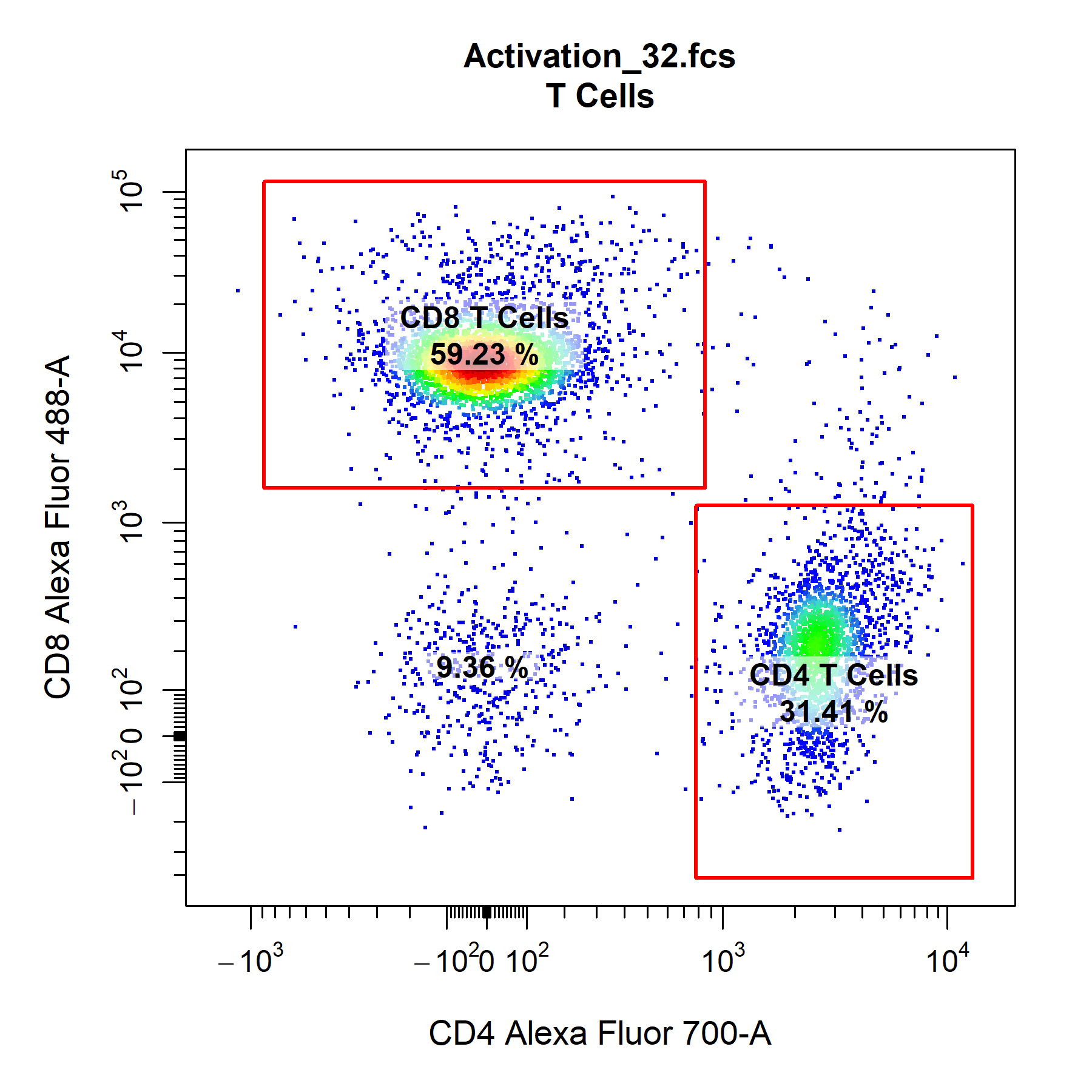
cyto_plot can also plot any 2D gate object in a 1D plot, it simply uses the minimum and maximum coordinates for the gate in the specified channel. Since statistics are computed in-line, cyto_plot will re-compute statistics using the newly constructed 1D gate. With CytoExploreR it is also possible to gate stacked density distributions and display the specified statistic for each data layer.
cyto_plot(gs[29:32],
          parent = "CD4 T Cells",
          alias = "CD69+ CD4 T Cells",
          channels = "CD69",
          density_stack = 0.7)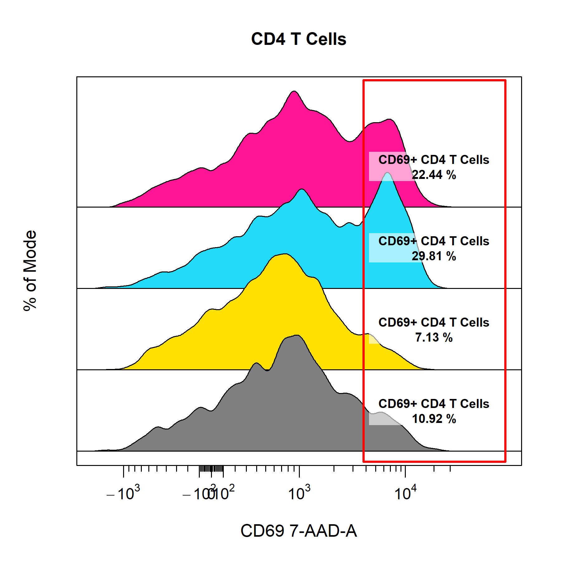
Labels
cyto_plot is its ability to label data layers with text and statistics. Plotted gates are automatically labelled by default but labels can also be added without gates by supplying a vector text to label_text. Users can add statistics to labels by specifying a vector of desired statistics to the label_stat argument. Supported statistics include count, frequency, CV, mean, geometric mean and median. The location of the labels can be set by mouse click by setting label_position to "manual" or by specifying the label co-ordinates manually through the label_text_x and label_text_y arguments. The labels will automatically be positioned on the mode of each data layer when no coordinates are selected or supplied. cyto_plot will automatically position labels to minimise overlap.
# Labels
cyto_plot(gs[29:32],
          parent = "CD4 T Cells",
          channels = "CD69",
          density_stack = 0.5,
          axes_limits = "machine",
          label_text = c("Label A",
                         "Label B",
                         "Label C",
                         "Label D"),
          label_stat = rep("median", 4),
          label_text_x = rep(75000, 4),
          label_text_font = 2,
          label_text_size = 0.8,
          label_text_col = "red",
          label_fill = "white",
          label_fill_alpha = 0.6,
          title = "Custom Labels")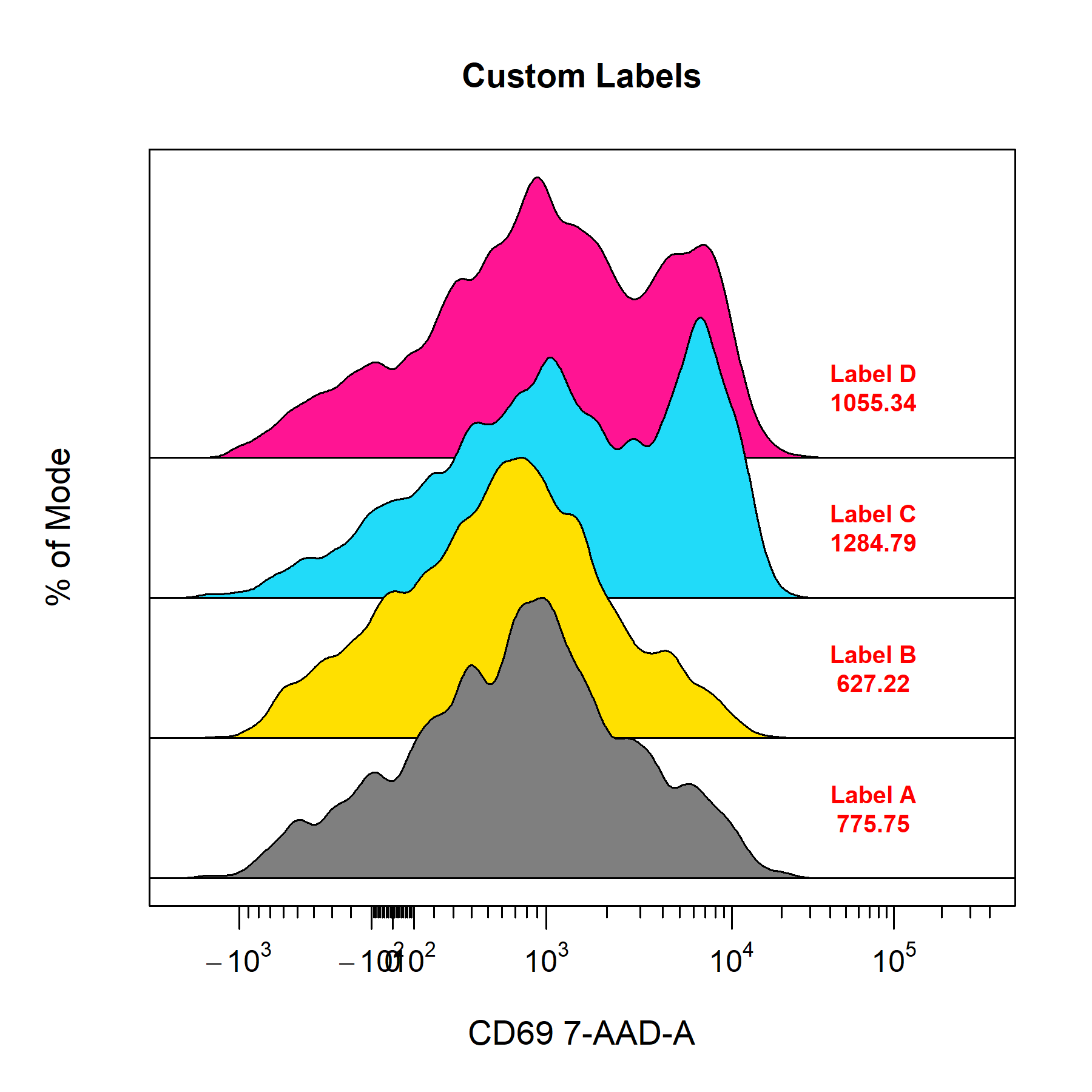
Overlays
cyto_plot makes it easy to overlay data or populations onto plots through the overlay argument. Simply supply the names of the populations to overlay to include them on the plot. The data is plotted in bottom-up order, it is easy to decipher which layer is which by setting the legend argument to TRUE. To make things a little easier, you can also set overlay to "descendants" or "children" to automatically overlay all descendant or child populations of the parent population.
# Overlay
cyto_plot(gs[[32]],
          parent = "T Cells",
          overlay = "descendants",
          channels = c("CD44", "CD69"),
          legend = TRUE,
          title = "Overlays")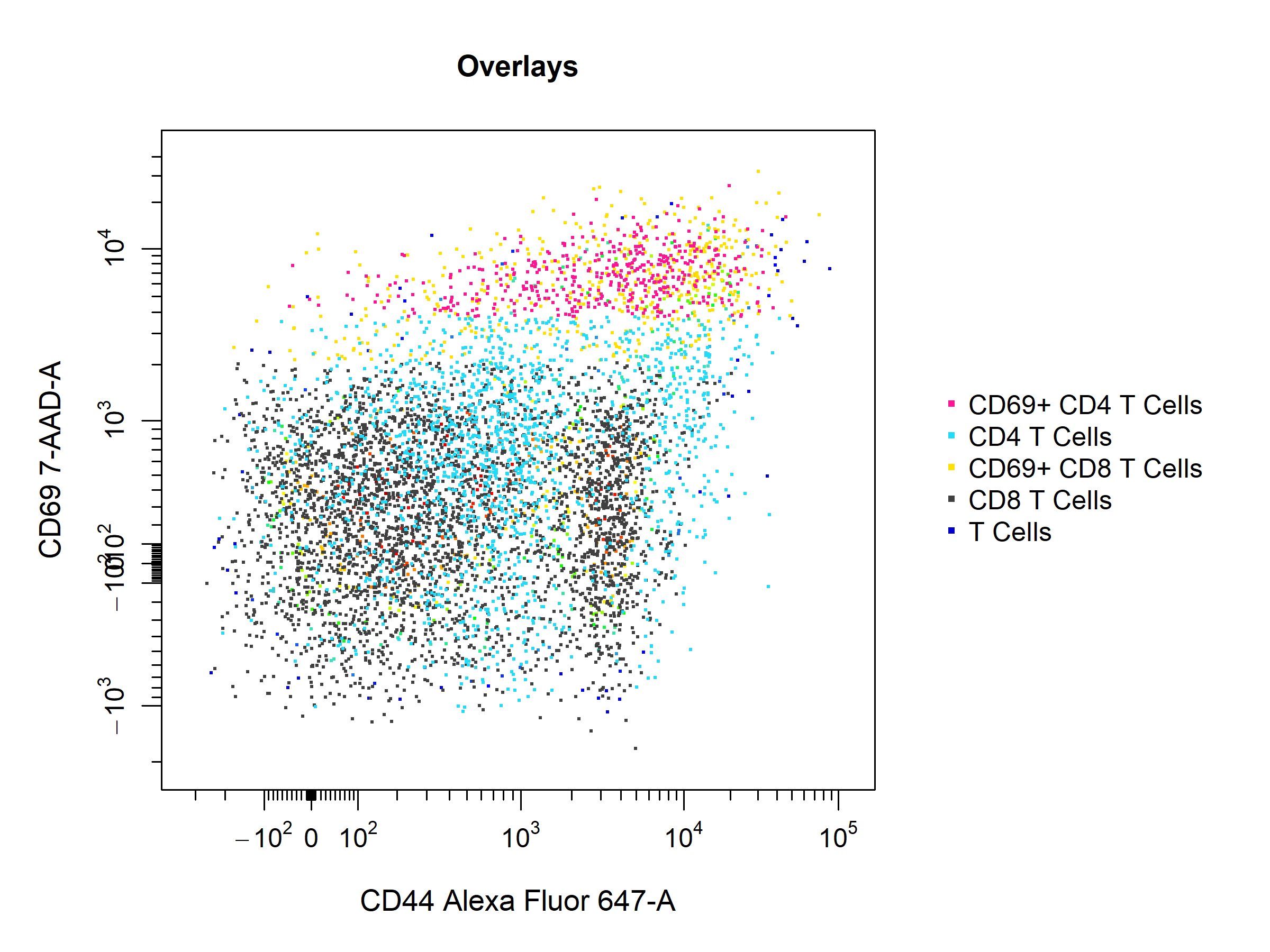
cyto_plot also allows the overlay of flowFrame or flowSet objects onto plots to easily make comparisons between samples. This feature is particulary useful in cyto_gate_draw as it allows users to overlay FMO controls and appropriate set gate co-ordinates.
# Extract unactivated sample
naive <- cyto_extract(gs, parent = "CD4 T Cells")[[27]]

# Manual overlays
cyto_plot(gs[32],
          parent = "CD4 T Cells",
          overlay = naive,
          channels = c("CD44", "CD69"),
          point_size = 3)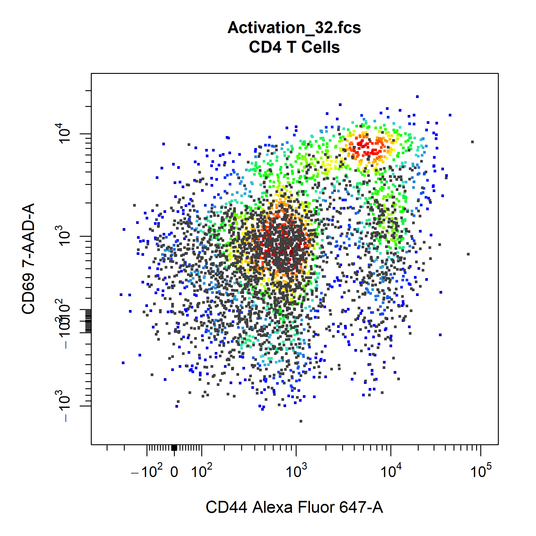
Groupings
cyto_plot. With cyto_plot users can group and merge samples into experiment groups prior to plotting. This means that any displayed statistics are calculated using all the available data, and that these statistics represent the mean for each experimental group. This makes it easy to summarise a large amount of data in a succinct way that is easy interpret and understand. Of course, this grouping can also be applied to density distributions and overlays, go ahead and give it a try! The days of cherry-picking samples are over!
# Experiment variables (if not entered in cyto_setup)
cyto_details(gs)$Treatment <- c(rep("Stim-A", 8), rep("Stim-B", 8), rep("Stim-C", 8), rep("Stim-D", 8), NA)
cyto_details(gs)$OVAConc <- c(rep(c(0, 0, 5, 5, 50, 50, 500, 500), 4), 0)
# Grouping
cyto_plot(gs[1:32],
          parent = "CD4 T Cells",
          alias = "",
          channels = c("CD44","CD69"),
          group_by = c("Treatment", "OVAConc"),
          contour_lines = 15,
          label_text_y = 39000)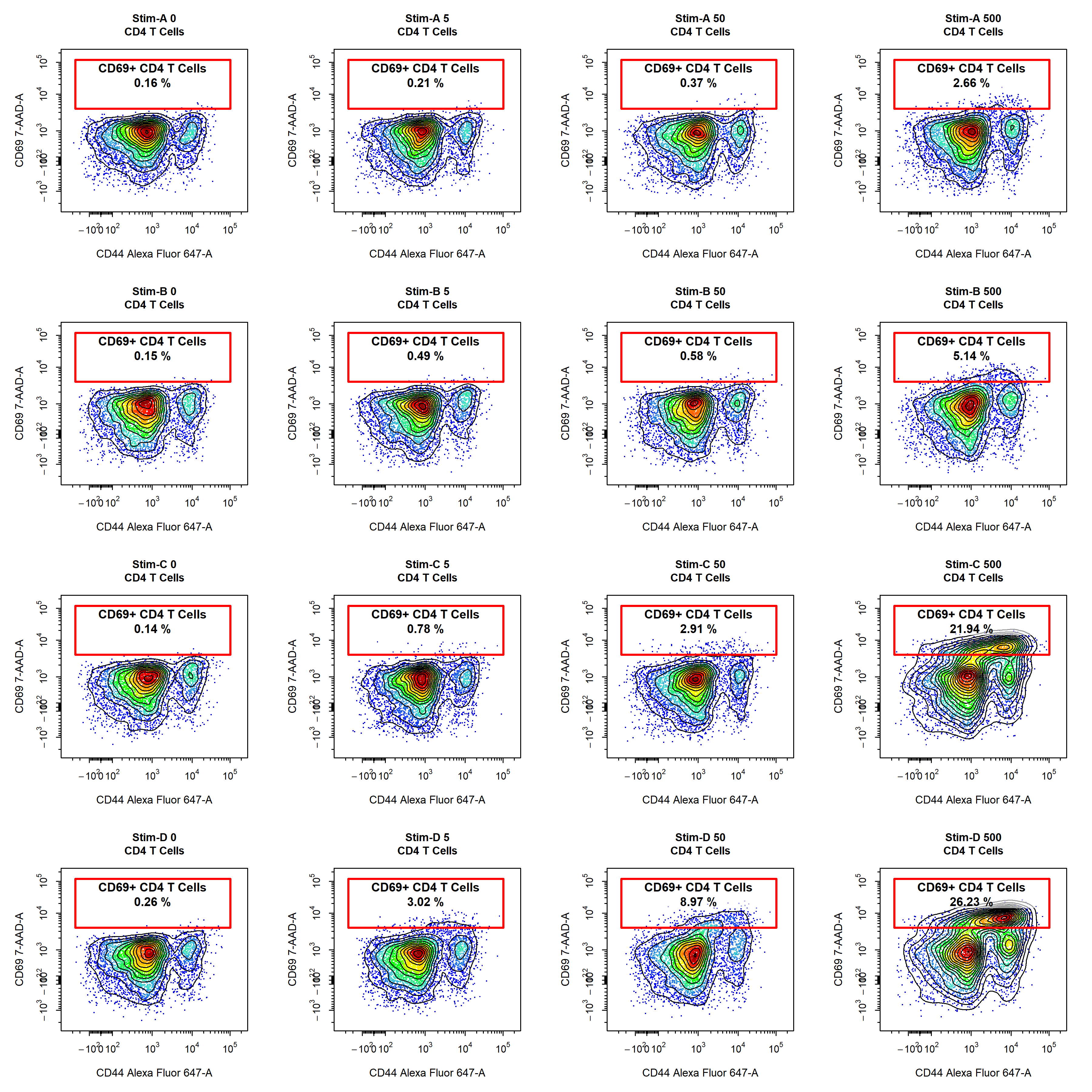
Custom Themes
cyto_plot through the cyto_plot_theme function. Users can specific plot characteristics within a cyto_plot_theme call which will be automatically inherited by all downstream cyto_plot calls. An issue will be created for users to share their favourite custom cyto_plot theme, the best themes will be shipped with CytoExploreR so that they are available to other users. To see what arguments can be altered through cyto_plot_theme, have a look at the output of cyto_plot_theme_args(). The theme can be reset by making a call to cyto_plot_theme_reset().
# Available theme arguments
cyto_plot_theme_args()

# Custom cyto_plot theme
cyto_plot_theme(contour_lines = 25,
                contour_line_col = "white",
                point_size = 3,
                point_col_scale = c("white",
                                    "yellow",
                                    "orange",
                                    "red",
                                    "darkred",
                                    "black"),
                border_fill = "black",
                border_line_col = "grey",
                title_text_col = "red",
                axes_text_col = "blue",
                axes_label_text_col = "purple",
                axes_limits = "machine")

# Theme automatically inherited
cyto_plot(gs[[32]],
          parent = "T Cells",
          channels = c("CD44", "CD69"))

# Reset theme to default
cyto_plot_theme_reset()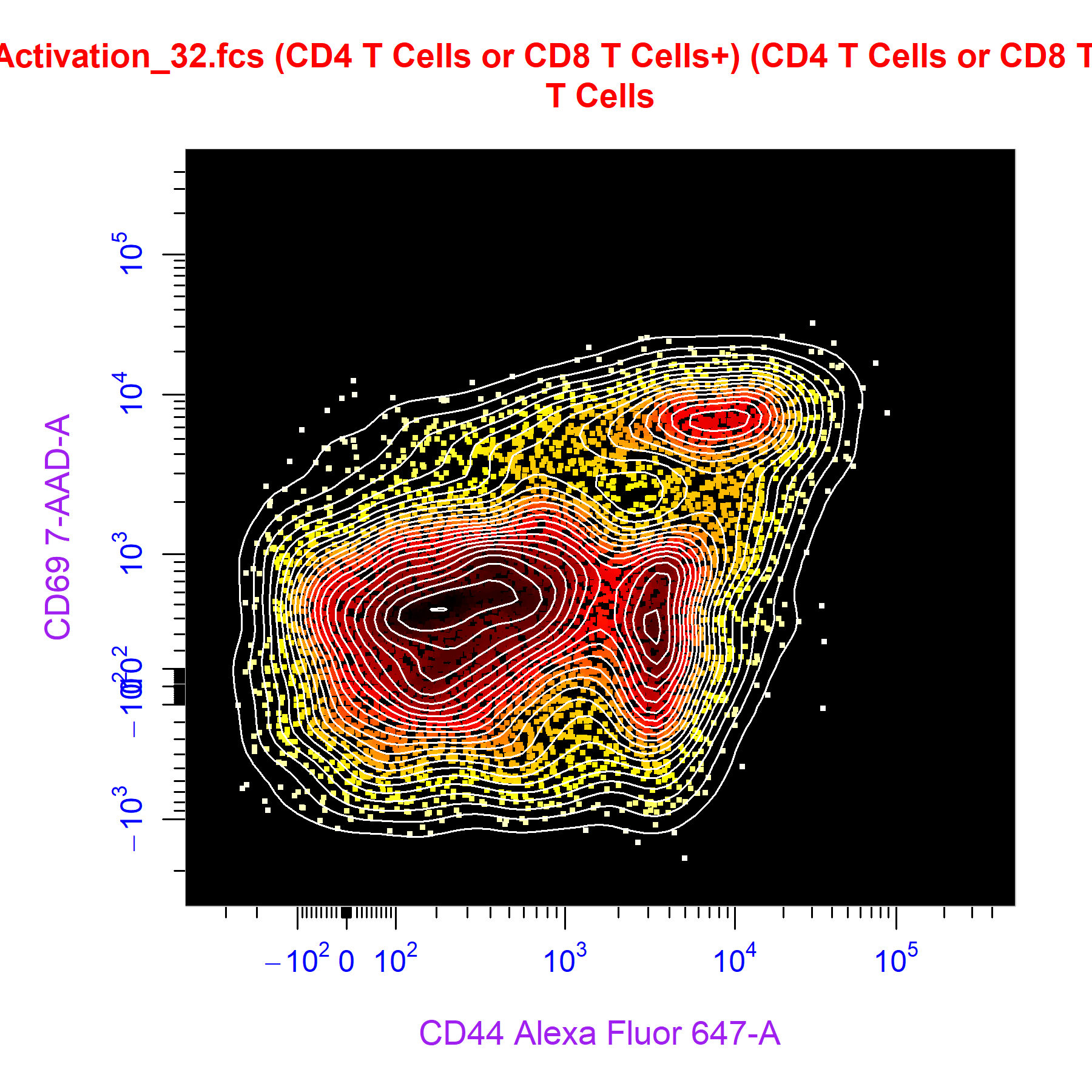
Save High Resolution Images
cyto_plot_save function. Once you are satisfied with a plot that you would like to save, simply call cyto_plot_save and re-run the cyto_plot call. cyto_plot_save can save images to png, tiff, jpeg, pdf and svg file formats. The desired file format is indicated by the extension of the file name passed to the save_as argument. The default resolution has been set to 300 dpi to ensure saving of high resolution images, this value can be altered through the res argument. The dimensions of the saved image can be altered by specifying the desired height and width in the specified units.
# Call cyto_plot_save
cyto_plot_save("Plot.png",
               height = 7,
               width = 7,
               units = "in",
               res = 300)

# cyto_plot call
cyto_plot(gs[29:32],
          parent = "CD4 T Cells",
          alias = "CD69+ CD4 T Cells",
          channels = c("CD44", "CD69"),
          contour_lines = 15,
          title = c("0 nM OVA",
                    "5 nM OVA",
                    "50 nM OVA",
                    "500 nM OVA"),
          point_size = 3,
          point_col = c("cyan",
                        "deepskyblue",
                        "blue",
                        "navyblue"),
          point_col_alpha = 0.5,
          label_fill_alpha = 0,
          label_text_y = 39000,
          label_text_size = 0.7)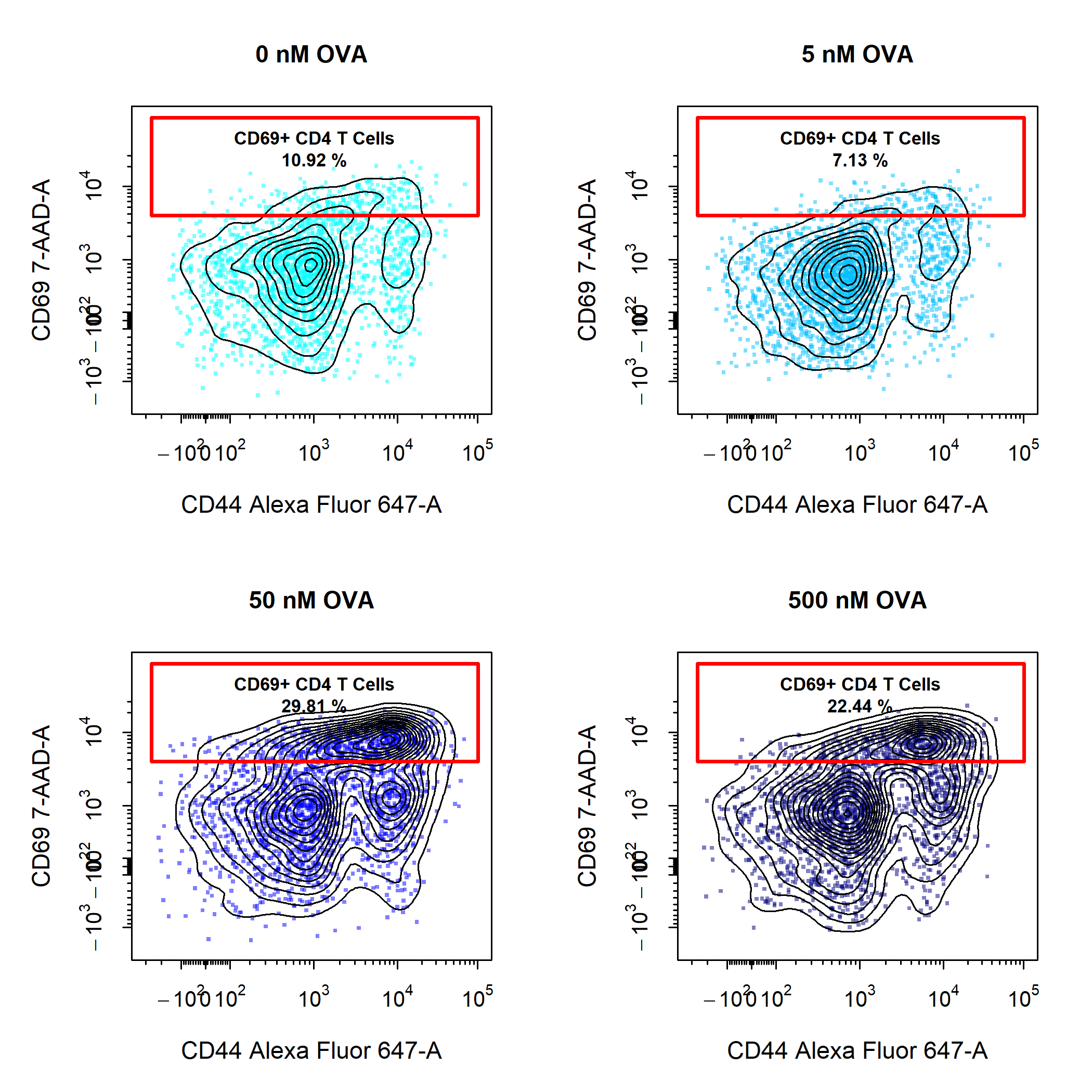
Custom Plot Layouts
cyto_plot plots using cyto_plot_custom. cyto_plot_custom will let CytoExploreR know that you are taking control over setting the plot layout and allow you to set the layout manually by supplying the desired number of rows and columns. cyto_plot_custom also talks to cyto_plot_save to save the custom plot, it is therefore important to let cyto_plot_save know when you are ready to save the plot by making a call to cyto_plot_complete. cyto_plot_complete will also tell CytoExploreR that you are no longer creating a custom plot, so it is important to run this even if you are not saving the plot. Through cyto_plot_complete, users can also indicate the desired number of rows and columns to reset the graphics device.
# Call cyto_plot_save
cyto_plot_save("Plot2.png")

# Create custom layout
cyto_plot_custom(layout = c(2,2))

# cyto_plot calls
cyto_plot(gs[[32]],
          parent = "CD4 T Cells",
          alias = "CD69+ CD4 T Cells",
          channels =  c("CD44", "CD69"),
          title = "CD4 T Cells",
          contour_lines = 15,
          label_text_size = 0.7,
          label_text_y = 39000,
          label_fill_alpha = 0)

cyto_plot(gs[29:32],
          parent = "CD4 T Cells",
          alias = "CD69+ CD4 T Cells",
          channels = "CD69",
          density_stack = 0.5,
          title = "CD4 T Cells",
          label_text = NA) # remove text in labels

cyto_plot(gs[[32]],
          parent = "CD8 T Cells",
          alias = "CD69+ CD8 T Cells",
          channels =  c("CD44", "CD69"),
          title = "CD8 T Cells",
          contour_lines = 15,
          label_text_size = 0.7,
          label_text_y = 39000,
          label_fill_alpha = 0)

cyto_plot(gs[29:32],
          parent = "CD8 T Cells",
          alias = "CD69+ CD8 T Cells",
          channels = "CD69",
          density_stack = 0.5,
          title = "CD8 T Cells",
          label_text = NA) # remove text in labels

# Tell CytoExploreR plot is complete for saving & turn off custom plotting
cyto_plot_complete()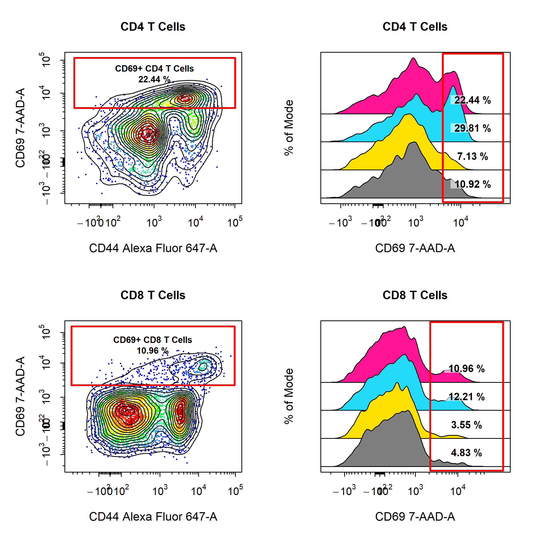
cyto_plot Wrappers
To take cyto_plot to the next level, there are also a series of cyto_plot wrapper functions that can provide powerful visualisations of your data. The use of these functions will be scattered throughout the package vignettes, but a brief description of each function is provided below:
-
cyto_plot_compensationto visualise compensation for flow cytometry data in all fluorescent channels. -
cyto_plot_exploreto plot 2D scatter plots of the data in all channels to quickly explore the data. -
cyto_plot_profileto plot 1D density distributions of the data in all channels to highlight expression profiles. -
cyto_plot_gating_schemeto plot entire gating schemes in a grid for analysis summaries or reports. -
cyto_plot_gating_treeto plot an interactive gating tree which shows relationships between gated populations. -
cyto_plot_gridto arrange plots into a grid without excess white space (coming soon).
Reporting Issues
cyto_plot is an essential component of CytoExploreR and is used throughout the package. If you notice any instances where cyto_plot does not perform as expected, please create a new issue so that the problem may be addressed. Likewise, if you have any feature requests or suggestions for improvements, please let me know by creating a new issue so that we can work together to implement these changes.